17th September, 2018
This weeks Tidy tutorial is going to look at borders. Adding a little flair to a border can really add something extra to the feel of a website.

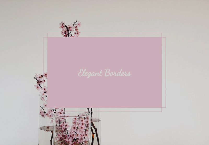
We’ve recently started working with a client with whose target audience is middle aged and older women, we wanted to give this website an elegant feeling, and we think we’ve achieved just that with additions such as these borders we’re going to talk about today.
This is a nice and quick tutorial, and we know you like that, you don’t always need to write lines upon lines of CSS to get great effects. So let’s jump in! We’ll start with the HTML markup needed:
<!DOCTYPE html>
<html>
<head>
  <meta charset="utf-8" />
  <meta http-equiv="X-UA-Compatible" content="IE=edge">
  <title>Elegant Borders</title>
  <meta name="viewport" content="width=device-width, initial-scale=1">
</head>
<body>
  <div class="container">
    <div class="border"></div>
  </div>
</body>
</html>
That’s all we need, a simple div with the class of ‘border’ wrapped in a container. We’re placing it a container so we can make this box responsive and add some padding to stop it hitting the sides of the page. The initial styling will look a little something like this:
*, ::after, ::before {
    box-sizing: border-box;
}

.container {
  padding: 2em;
}

.border {
  position: relative;
  width: 100%;
  max-width: 550px;
  height: 340px;
  /* We're picking out a colour from the background image we're using but you can use any colour you'd like */
  background-color: #ccaeb9;
}
Here’s what you should be seeing, bear in mind we’ve got a couple of extra generic styles here but the fundamentals will be the same:

We’ll make the start on the borders themselves now, to get this effect we’re going to make use of the before and after pseudo elements. Targeting both before and after first for the generic styles this is what we’ll need:
.border::before,
.border::after {
  content: '';
  position: absolute;
  border: solid 2px #ccaeb9;
}
After this change we aren’t going to see a difference, it’ll look exactly the same until we target the pseudo elements separately to position each border, let’s start with the before:
.border::before {
  left: -20px;
  width: calc(100% + 40px);
  height: 100%;
}
Before we break it down, here’s what you should be seeing:

Right, now let’s look at that CSS block. Starting with the height, this is clear, we want the height of the border to be exactly that of the box. The width, we want 20px each side of the box for the overlapping border style, we do this in a way which can stay responsive. Using calc we add the overflow of the box to the 100% width. Now to finish the before section off we use left to move the border left, giving each side an equal space around the box. Another way this can be visualised is like this:
.border::before {
  left: -20px;
  /* The minus value of left will decide how much of a gap you'd like to between the container and the border */
  width: calc(100% + 40px);
  /* The addition to 100% must be double the value you gave to left, ours being 40px */
  height: 100%;
}
The after is going to look similar to above, but the width and height is going to be reversed:
.border::after {
  top: -20px;
  width: 100%;
  height: calc(100% + 40px);
}
The opposite effect should be given here, looking like this:

And that’s it, nice and simple here. Playing with pixels added to the 100% in the calc and also the left we can make the spacing of the borders around the box smaller and larger. I’m sure you can also think of ways to make this look even better with hover animations too! Have a play around on the Pen and share what you make.
codepen.io/TidyDesign/pen/qMMBoL/
Thanks for reading, catch you again soon.
Luke