11th July, 2024
Selecting the right fonts for your website is essential for creating a compelling design and enhancing user experience. The fonts you choose can influence readability, visual appeal, and the professional tone of your site.

In this guide, we’ll walk you through the key considerations for choosing fonts, ensuring your website looks great and functions well. Whether you’re unsure where to start or need specific recommendations, we’re here to help you on this selection journey.
Understand Your Brand Identity
Your brand identity should be the primary guide when selecting fonts. Consider the message you want to convey: is your brand formal or casual, modern or traditional? Additionally, think about your target audience and what kind of impression you want to make. Making a wrong choice here can drastically change how your site is perceived.
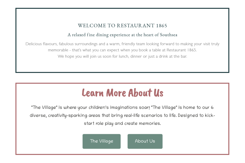
Examples of effective font choices include Little Giggle Street’s fun, handwritten-like font, chosen to give a fun welcoming feel to people looking to book experiences for their children. On the other hand, Restaurant 1865 holds a mix of serif fonts for titles and clean, round sans-serif fonts for the body, conveying a blend of high-quality elegance with modern touches. Choosing the right fonts helps communicate your brand’s essence effectively and enhances the overall user experience.
Prioritise Readability
No matter how stylish a font is, if it’s hard to read, it can frustrate your visitors. Ensure your chosen fonts are legible across different devices and screen sizes. Use a base font size of at least 16 pixels for body text, and aim for a line height of 1.5 times the font size to enhance readability. Additionally, ensure there is sufficient contrast between the text and background.
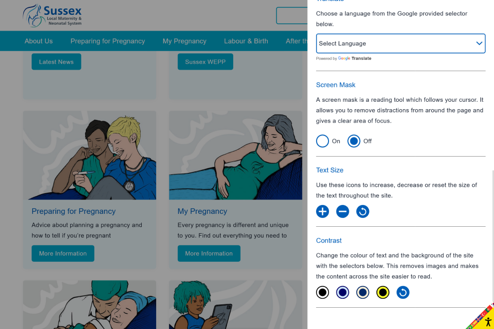
A great example of legibility can be found on the Sussex Local Maternity & Neonatal System’s website. They use a clear and easy-to-read font with a reasonable line height. To further enhance readability, consider adding a “contrast selector” that allows users to change the background and text colours to combinations known to be easier to read. You can test this by visiting their site, clicking the yellow accessibility icon in the bottom right of the screen, and experimenting with the contrast selector.
Limit Font Variety
Using too many fonts can make your website look cluttered and unprofessional. It’s best to stick to a maximum of two or three fonts. Choose a primary font for headings and prominent text, a secondary font for body text, and an accent font for special elements like quotes or call-to-action buttons.
Et Games is a great example of effective font variety. The title text, with its larger size and textured styling, would be overwhelming if used throughout the entire site. Instead, they use this distinctive font for main titles, while the body font maintains a similar aesthetic with squared serifs but is much easier to read at smaller sizes commonly found in the body of a website.

Where to Find Fonts
Finding the right fonts for your website is crucial for achieving the desired look and feel. There are several resources where you can discover high-quality fonts:
Google Fonts
Google Fonts is a popular and extensive library of free-to-use fonts. It offers a wide range of styles and is easy to integrate into your website with just a few lines of code. Google Fonts ensures that the fonts are optimised for web use, providing fast loading times and good performance across different devices and browsers.
Adobe Fonts
Adobe Fonts (formerly Typekit) provides a vast collection of fonts that can be used for web and desktop applications. With a subscription to Adobe Creative Cloud, you gain access to high-quality, professionally designed fonts that can enhance your website’s typography.
MyFonts
MyFonts offers a large selection of both free and premium fonts. It includes a variety of styles and designs, catering to different needs and preferences. You can purchase individual fonts or font families, ensuring you find the perfect match for your website.
When searching for fonts you’ll find a lot of “grey” sites, where legality and licensing are unclear. Using reputable sites, like those above, will allow you to browse without worry. You’ll find all the terms and license information clearly stated on their websites, and if you’ve any questions on what’s okay to use and not, get in touch and we can help clear things up.
Conclusion
Choosing the right fonts for your website involves balancing aesthetics, readability, and performance. By considering your brand identity, limiting font variety and pairing fonts thoughtfully, you can create a visually appealing and user-friendly website. Remember, the right fonts can enhance your content and elevate your overall design, making your website more engaging and professional.
Feel free to reach out if you need further advice or specific font recommendations for your website!