15th June, 2024
Tidy Tip: Checking Mobile vs Desktop Usage in Google Search Console
In today’s digital age, understanding how your audience accesses your website is crucial for optimising user experience and maintaining high engagement rates. One of the best tools for gaining this insight is Google Search Console.
Here at Tidy Design, we recommend regularly checking the mobile vs desktop usage data to ensure your site performs optimally across all devices.
Step 1: Obtain the Data
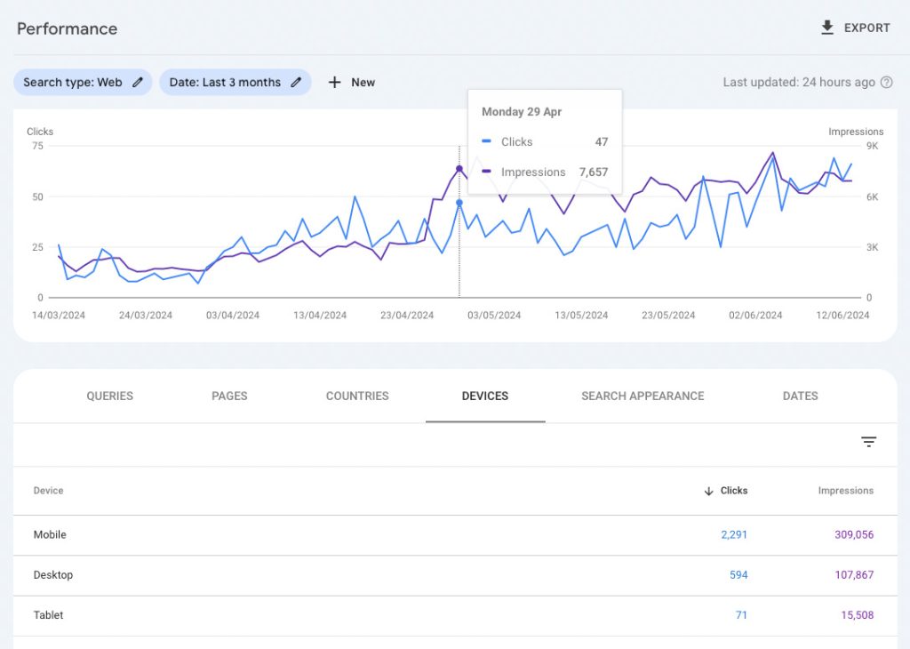
Google Search Console provides detailed analytics on how users interact with your site from different devices. By navigating to the “Performance” report and selecting the “Devices” tab, you can see a breakdown of traffic coming from mobile, desktop, and tablet users. This data is invaluable in understanding which device your audience prefers, allowing you to tailor your website’s performance to their needs.
Step 2: Review Your Website
Once you have this data, it’s time to take a closer look at your website, focusing particularly on high-traffic pages or posts. If your audience predominantly uses mobile devices, ensure your site is fully optimised for mobile viewing. This includes checking for responsive design, fast loading times, and easy navigation on smaller screens. The same applies if desktop users form the majority, make sure your site is user-friendly on larger screens.
Marketing Tips & SEO
By regularly checking mobile vs desktop usage and optimising pages accordingly, you can provide an enjoyable experience for everyone. This proactive approach not only improves user satisfaction, but it can also boost your search engine rankings. For more tailored advice and support with optimising your website, feel free to contact Tidy Design. We’re here to help.
Until next time, keep it Tidy!
Mike